


Do you find yourself checking Google Analytics and floating through the reports only to leave the platform without gaining actionable insight? Hello, data cobwebs! Here’s to clearing things up with my 3 favorites on the fly Google Analytics reports.
Source/Medium Report
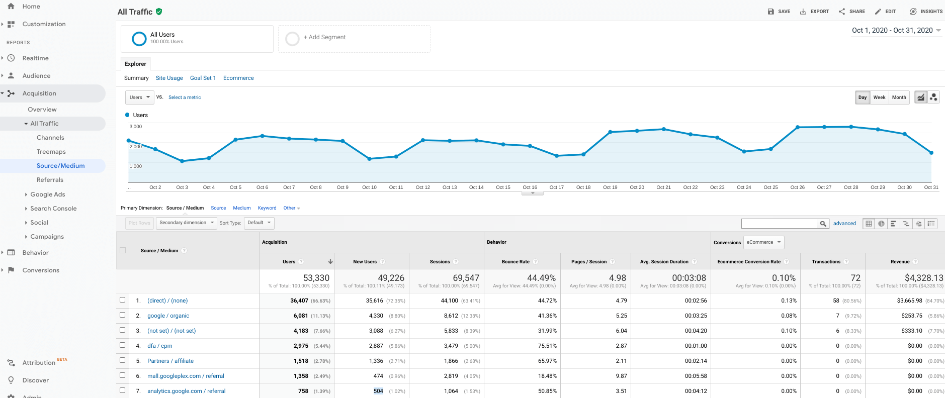
This is arguably my favorite report in the world of data analytics because it’s quick, encompassing, and actionable. This “big picture” report lets you quickly identify where your traffic is coming from, and it’s more detailed than the Acquisition > Overview report because you are able to see key metrics by source and medium.
How you find it: Acquisition > All Traffic > Source/Medium
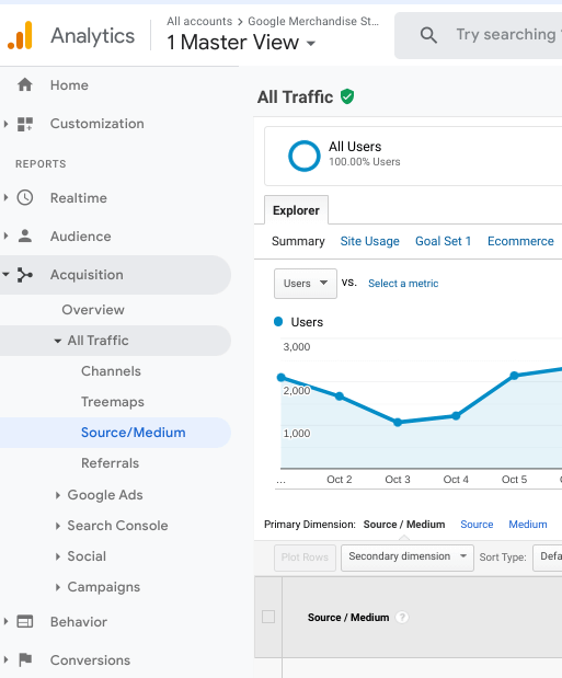
You’ll find it under Acquisitions – aka the collection of reports that tell you where your traffic is coming from. From there, navigate to All Traffic and Source/Medium to get a bit more granular.
What am I Seeing?
Once you’ve made it to your destination, you’ll see a high level glance of your marketing performance by traffic source. Data includes:
- The sources from which your traffic is coming from including direct, organic, social, email, and referral traffic
- Key performance metrics related to the traffic sources like Users, Bounce Rate, and Conversions
- A graph that will show you how your traffic is trending over time so you can explore all of those peaks and valleys
Make it Actionable:
Why do we sift through data if we can’t do something with it, amiright? After looking at this report, for example, you will be able to go back to your team and report on the initial performance of a newly launched multichannel campaign. Did a new offer go live this week with an eblast, social campaign, and display ads? Take a quick look at the Source/Medium report each day to report back on how things are going. Here are some ways to make the most of it:
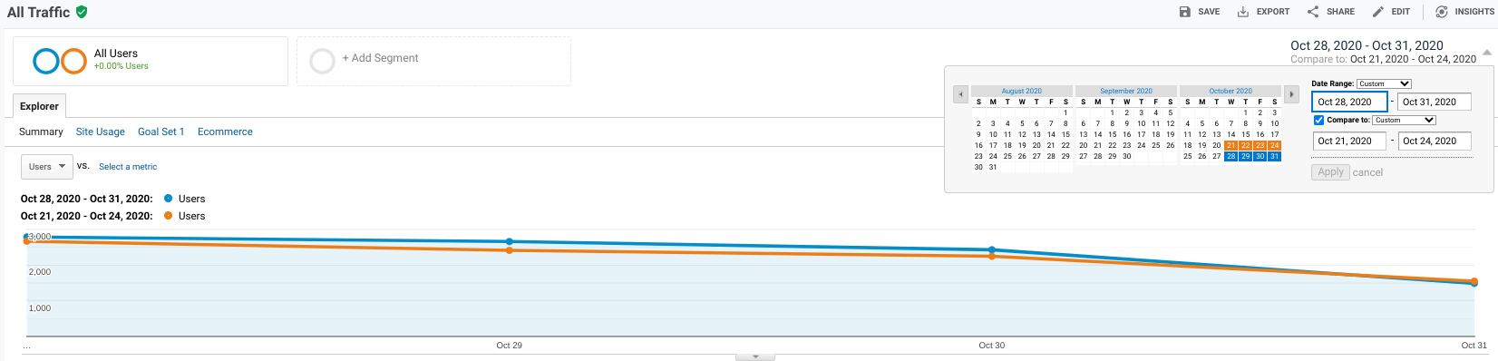
- Add a comparison period – Current traffic can only tell you so much. Setting that comparison period is what gives you real insight. My favorite comparison periods are “previous period” and “previous year.” However, here is a tip – When you set a previous period comparison, many times Google will compare different days of the week. That won’t give you an apples-to-apples comparison in many cases. If you set a custom date range (in which the days of the week match perfectly instead of letting Google set the previous period), your data will mirror quite perfectly and you can see a better day-of-the-week comparison.
- Use custom segments – View traffic coming in by source from specific segments of users like age, gender, and location. You can even use the Audience > Interests report to help define your custom segment and look at activity from your typical visitor vs other segments.
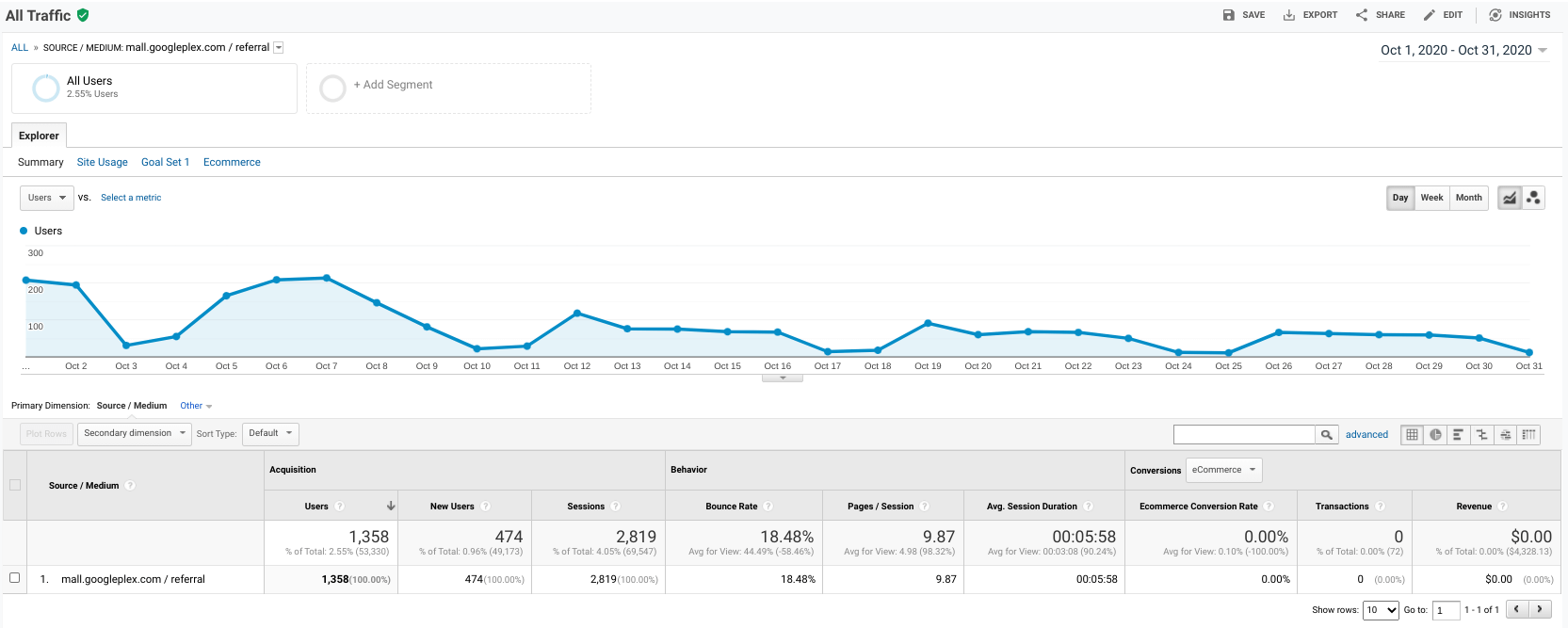
- Click into each source/medium – See key metrics and data trends for each source/medium by clicking into each of them. Choose newsletter/email after an eblast send to see that pretty peak in traffic for that source specifically.
- Configure Your Goals – We all have our events and goals set properly and not only that, goal values have been set so we can break down our revenue by source (ahem).

Just in case every goal isn’t configured and firing beautifully, this goals overview is most helpful. And my friend, Niel Patel, says it best when it comes to using Google Analytics Goal Values. Seriously though, if you can define a per-visit value for every traffic source, that’s grounds for a data dance.
Tag your URLs – Let Google know more specifically where your traffic is coming from by tagging your incoming links. Fortunately, Google has a nifty URL Builder that makes it very simple to add code after your website URL. An example email URL that includes these tags would look like this:
https://yourwebsite.com/?utm_source=newsletter&utm_medium=email&utm_campaign=aug_offer
- Add a Secondary Dimension – You can quickly add Campaign as the secondary dimension to dive in further. This is especially helpful if you have campaigns running within the same source but with different messaging. Multiple paid social campaigns, for example.
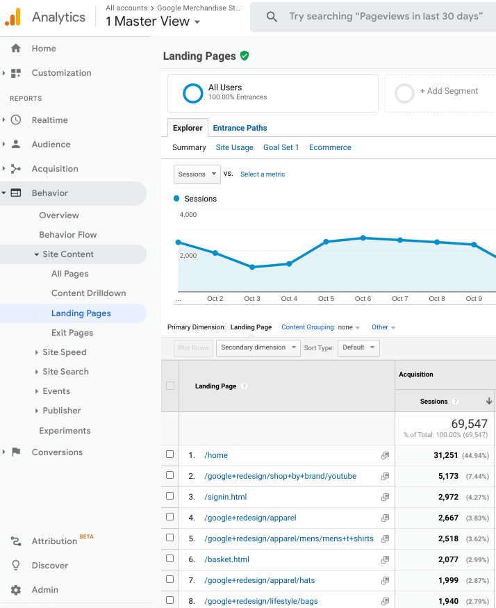
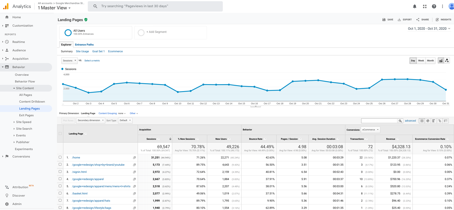
Landing Pages Report
Now that we know how users are getting to your website, let’s look at what they are doing once they arrive – via the Landing Pages report.
How you find it: Behavior > Site Content > Landing Pages
You’ll find it in the Behavior category of reports which tells you how your users interact and behave on your site.
What am I Seeing?
The description says it all. It’s where your users land when they first get to your website, whether it be from an organic search, a social media post, or typing in the URL directly. Then you can compare the pages to see which are most engaging. You will find:
- The subcategory URLs (the part of the URL after the “/”) of the pages your users first land on
- Key performance metrics related to the Acquisition, Behavior, and Conversion interaction of the users on those pages
- A graph that will show you how the sessions are trending over time for all landing pages
Make it Actionable:
This is your chance to see how visitors are interacting on your website when they arrive. TIP: Look for data anomalies – those outliers that stand out from others and make you say, “Well would you look at that.”

Here are some examples:
- Hot Pages – Are any of the top-performing pages surprising? Perhaps there is a page with high traffic that’s driving conversions with compelling content you could formulate your next social post or blog around. That’s hot. Also, click on the pages to see traffic trends over time.
- Improve Page Engagement – Bounce rate is the ticket here. Look for pages that have a high bounce rate, navigate to those pages, and find ways to make them more engaging. Or, perhaps the user was not supposed to land there at all.
- Improve Page Speed – Landing Pages with a high bounce rate can also help you identify page speed issues. Take steps to lower page load time to increase retention.
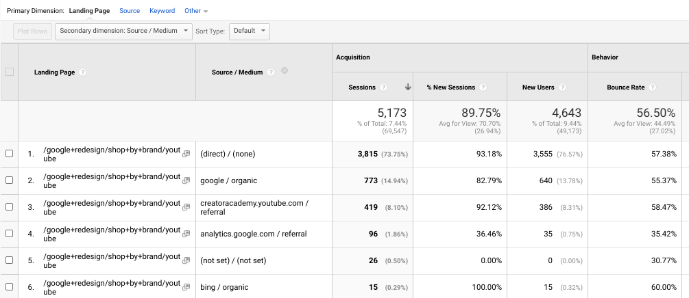
- Dig Deep – Click into one of the pages and add Source/Medium as a secondary dimension. This will show you where your visitors to that particular landing page came from. From there, take note of the performance metrics and again, look for outliers and compare. Are any of the top converting pages surprising? Perhaps a page with less traffic is generating more revenue.
- Don’t Forget to Isolate – Set your date ranges and segment your users so you can isolate and analyze those subsets of data. HINT: If you already made the adjustments while viewing the Source/Medium report in the same session you shouldn’t have to do it again.
Custom Alerts
The last one isn’t a report you check. It’s a report that, well – checks you. You are able to set up various custom alerts so that Google Analytics will signal you when something is amiss, or if you are really knocking it out of the park. Talk about proactive.
How You Find It: Customization > Custom Alerts
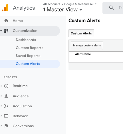
You can find past alerts and create new ones by going to the Customization section of Google Analytics. Once you land on the Custom Alerts page, you will see your alert history. To make a new alert click on Manage Alerts, and Google Analytics will take you to create a Custom Alert in the Admin section at the View level.
What am I Seeing?
The New Alert process is pretty straightforward, although there are endless options because you can create alerts based on various metrics and values. This is what the setup looks like:
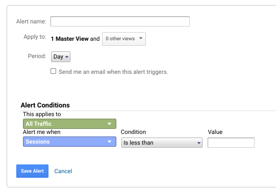
You simply name your alert, provide the email address for when the alert is triggered, and define the conditions.
Make it Actionable:
So what sort of alerts are useful? I’d tell you “it depends,” but no one likes that answer, so I’ll give you some of my favorites:
- Sessions Spike – I want to know when we are truly knocking it out of the park when it comes to website traffic. Google Analytics will alert me when Sessions increase by more than 50% compared to the same day in the previous week. The percentage can vary anywhere between 20%-60%, depending on the usual ebb and flow of your traffic. I like to compare to the same day of the week for an apples-to-apples comparison because traffic levels often differ by day of the week.
This is what the Sessions Spike set up looks like:
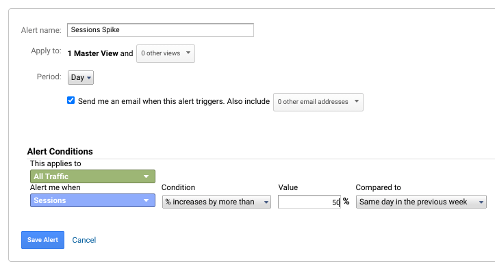
When I’m alerted, I can immediately take action and go to guess where… the Source/Medium report is to see where all this fantastic traffic is coming from. This could also alert you to trouble with bots, etc.
- Traffic Flatline – Speaking of trouble, if my traffic ever flatlines I want to know before you can say, “Is the website down?” (the worst). This alert will trigger if Sessions are ever less than 1. Here is how I set it up:
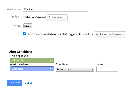
I’ll be able to immediately troubleshoot issues like analytics scripts not firing or if the website is in fact down.
- Organic Decline – Custom Alerts also let you break it down so you are alerted when a specific medium or source of traffic experiences changes. For example, another issue I like to keep on my radar is if there is a substantial drop in organic traffic. I would apply the condition to Medium – Matches exactly – organic. I chose decreases of more than 60% because that’s more than the usual search fluctuation, and I compare week over week (make sure your Period is set to Week in the top section).
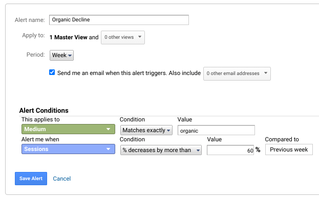
Knowing when your organic traffic declines could alert you to things like search algorithm changes.
Here are some other popular alerts:
- Page Load Time – To help control bounce rate.
- Bounce Rate – Great if you are making major site edits.
- Conversion Rate – To alert you when conversions tank. This could indicate a hiccup in goal tracking.
For even more ideas, Moz is super thorough with this list of Custom Alerts.
Don’t Stop There. Dig Deeper with a Data Dashboard:
Those are my 3 super fly on the fly Google Analytics reports you can lean on in a crunch – but don’t stop there. These reports alone won’t give you the full picture of your website and digital marketing performance. For a more comprehensive overview, there are several great dashboard options. Using Google Data Studio is just one example of pulling your data from multiple platforms into an interactive dashboard. If you’d like to dig deeper, I’m a fan of Google Analytics Academy and one of their courses is Introduction to Data Studio. As one of my mentors says, ABL (always be learning).
The team at Hughes Media can help you configure and navigate Analytics, create Google Data Studio dashboards, and help you make decisions based on your results. Contact us today for a free consultation.
Goodbye, data cobwebs. Hello, actionable data!
About the Author:
Deedra Hughes
Experienced President with a demonstrated history of working in the marketing and advertising industry. Skilled in Digital Strategy, Search Engine Optimization (SEO), Integrated Marketing, Advertising, and Pay Per Click (PPC). Strong business development professional with a Bachelor’s Degree focused in Communications from Ohio University.